
You’ve probably heard someone throw around “UX” and “UI” as if they’re the same thing — or worse, as if one makes the other irrelevant. I get it. The jargon gets exhausting. But here’s why it actually matters for your business: a website that looks stunning but frustrates visitors will cost you customers. And a website that works perfectly but looks amateurish will cost you trust. Getting both right is the difference between a site that converts and one that quietly drives people away.
What Is UX Design?
UX stands for User Experience. It’s everything a visitor feels when they interact with your website — how easy it is to find information, how natural the journey from landing page to enquiry feels, and whether they leave satisfied or confused.
UX design is largely invisible when it’s done well. Nobody thinks “wow, that navigation was intuitive” — they just find what they need and get on with it. But when UX is poor? They notice immediately. They can’t find the contact form. The checkout process has too many steps. The page takes forever to load on mobile. They leave.
In my experience, UX is less about aesthetics and more about logic. It’s asking: what does this visitor need, and what’s the clearest path to get them there? That involves research, planning, testing, and a genuine understanding of how real people behave online — not how we wish they’d behave.
The Nielsen Norman Group, arguably the world’s most respected authority on UX research, defines user experience as encompassing “all aspects of the end-user’s interaction with the company, its services, and its products.” That’s a broad definition on purpose — because UX really does touch everything.
What Is UI Design?
UI stands for User Interface. This is the visual layer — the buttons, typography, colour palette, icons, spacing, and layout that users actually see and interact with. If UX is the architecture of a building, UI is the interior design.
Good UI design means your website looks polished and professional. It means your call-to-action buttons stand out, your text is readable, your brand colours are applied consistently, and every element feels deliberately placed. Tools like Google Fonts give designers access to hundreds of typefaces that can dramatically change the personality of a site, and resources like CSS-Tricks show just how much craft goes into building visual interfaces that actually work.
UI is also about consistency. When buttons look different on every page, or the spacing feels random, visitors unconsciously lose trust. It signals that nobody’s really in control — and if nobody’s in control of the website, are they in control of their business?
Why People Confuse the Two
The confusion is understandable. UX and UI are deeply intertwined, and in small businesses or agencies, the same person often handles both. But they’re genuinely different disciplines with different goals.
Think of it this way: UX asks “does this work?” and UI asks “does this look right?” A website can have beautiful UI and terrible UX — like a gorgeous restaurant with terrible service. It can also have excellent UX but poor UI — think of an old, clunky-looking government website that’s actually fairly easy to navigate once you get past the visual noise.
The best websites — the ones that actually convert visitors into customers — nail both.
How UX Affects Your Business Directly
This is where it gets practical. Poor UX directly hits your bottom line.
Bounce Rate and Lost Customers
If visitors can’t find what they’re looking for within a few seconds, they leave. Research consistently shows that people make judgements about websites extraordinarily quickly — and a confusing layout, buried navigation, or unclear calls to action all contribute to high bounce rates. That’s potential customers walking out the door before they’ve even had a chance to see what you offer.
Mobile Experience
More than half of web traffic now comes from mobile devices. If your UX hasn’t been designed with mobile in mind — if buttons are tiny, text requires zooming, or forms are a nightmare to fill in on a phone — you’re actively pushing away a huge portion of your audience. Tools like Google PageSpeed Insights can show you exactly how your site performs on mobile, and the results are often sobering.
Conversion Paths
Every page on your website should have a purpose and a next step. Good UX maps out those journeys deliberately. For example, my post on landing page design tips goes into detail on how to structure a page specifically to guide visitors towards taking action — whether that’s filling in a form, making a call, or clicking through to another page.
How UI Affects Your Business Directly
UI might seem like the “fluffy” part of web design — just making things look nice — but its impact on business outcomes is very real.
First impressions matter enormously online. Studies cited by Smashing Magazine have shown that users form opinions about a website’s credibility within milliseconds of landing on it, and visual design is a huge driver of that perception. A dated, cluttered, or inconsistent interface tells visitors — fairly or not — that your business might be the same.
UI also affects readability and comprehension. If your text is too small, too light, or set in a font that’s difficult to read, people simply won’t read it. All the carefully crafted copy in the world won’t matter if the typography makes it a chore to get through. MDN Web Docs and W3Schools are both excellent references for understanding the technical side of how fonts, contrast ratios, and spacing should be implemented for accessibility and readability.
What a Good UX and UI Process Actually Looks Like
When I work with clients on a new website, I don’t start by picking colours or fonts. I start by asking questions: Who are your customers? What do they need when they arrive on your site? What action do you want them to take? What’s stopping them from taking it right now?
That’s UX thinking. Only once we’ve mapped out the structure — the pages, the navigation, the key journeys — do we move into the visual design phase.
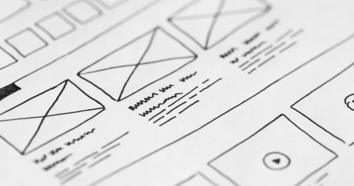
Wireframes First, Visuals Second
A wireframe is a rough blueprint of a page: boxes representing where content will go, placeholders for images, labels for buttons. It’s deliberately plain because the point is to test the logic before investing time in aesthetics. Does the page flow make sense? Is the call to action in the right place? Is there too much information competing for attention?
Once the wireframe is approved, we layer in the UI — the brand colours, the typography, the imagery, the micro-interactions that make a site feel alive. Platforms like Wix, Squarespace, and WordPress have made it easier than ever for business owners to build their own sites, but the templates they offer can sometimes lead people to skip this thinking-first stage — and that’s where both UX and UI start to suffer.
Testing With Real Users
Even a small amount of user testing — asking a handful of people to try and complete a task on your website while you watch — can reveal problems you’d never spot yourself. You’re too close to your own business. You know where everything is and why. Your customers don’t.
Common Mistakes Small Businesses Make
In my years of building websites for small businesses, I see the same UX and UI mistakes come up again and again:
- Navigation that’s too clever. Hiding menu items behind obscure icons or using non-standard labels (“Our World” instead of “About”) might feel creative, but it costs you visitors.
- Too many calls to action. When everything is urgent, nothing is. Choose one primary action per page and make it obvious.
- Ignoring contrast. Light grey text on a white background might look elegant, but it fails accessibility standards and frustrates readers. Proper contrast isn’t optional.
- Inconsistent branding. If your homepage looks like it was built by a different person than your services page, that’s a UI problem — and it undermines trust.
- No mobile testing. Designing only on a desktop and hoping it looks fine on phones is a gamble you’ll almost certainly lose.
If you’re not sure how your current site stacks up, my web design services include a review of both the UX and UI before any work begins, so we always know exactly what we’re dealing with.
UX and UI Are a Partnership, Not a Competition
The takeaway here isn’t to pick one over the other — it’s to understand that they serve different but equally important purposes. UX without UI is a site that works but looks untrustworthy. UI without UX is a site that looks great but frustrates everyone who uses it.
Small businesses often have limited budgets and need to make every decision count. The good news is that getting UX and UI right doesn’t require an enormous investment — it requires the right approach from the start. That means thinking about your visitors before you think about your preferences, mapping journeys before choosing fonts, and testing assumptions rather than just guessing.
When both are working together, visitors don’t notice either. They just find what they need, trust what they see, and take the action you want them to take. That’s the goal.
Ready to Get Both Right on Your Website?
If you’re not confident that your current website is doing justice to either the experience or the interface — or if you’re starting from scratch and want to get it right first time — I’d love to have a chat. Head over to the contact page for a free, no-obligation quote, and let’s talk about what your website could actually be doing for your business.